
How to Choose Your Decorating Colors - Home Decorating 101
There is a lot to say about colors; color combinations can make or break a room, set a mood and a balance, transmit a feeling and express a style.
We have narrowed down the basics of the color theory for interior design, to help you decide on your next throw pillow colors, click on that accent rug that you have been checking out for a while, decide on what color your next kitchen napkins will be or any home decor decisions;
you will master your color schemes skills with the help of these tips, to set the basics and the tone of your home decor
there are three defining aspects when playing with colors on your interior designs decisions, color wheel, color harmony and the context of where and how are you using these colors; these will represent the basics on where you will build in the rest of your design choices

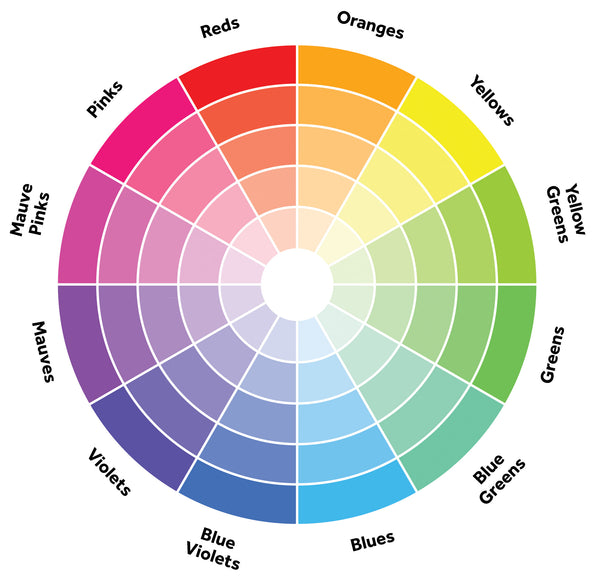
Color Wheel

Primary colors
Makes me remember kinder garden when you are learning the colors, and they teach you about how from three colors you can start building a rainbow; well, same with design, three colors are the starting point.
Red, yellow and blue are the colors from where the rest of the colors will derivate and from where you will get the secondary colors
Secondary Colors
green, orange and purple will be your secondary colors, that comes from mixing the three essential,
Tertiary Colors
tertiary colors like yellow-orange, red-orange, red-purple, blue-purple, blue-green and yellow-green are born by the combination of the primary and secondary colors, and that's the reason of the two words name
draw a line in the center of the wheel, and you'll get warm colors (red, orange, yellow) these will transmit energy, brightness, action, and on the other side you will have cool tones (blue, green, purple) that symbolize calm, peace, serenity
Color Harmony

Color harmony is about how can you make the color pleasing to the eye, creating order and bringing balance to the room, is finding the right balance between a chaotic scene or a too bland one,
Color harmony will also help you deliver the story that you want to transmit, create visual interest and a sense of equilibrium in the design
How to find the right harmony? there are a few ways that we will explain here
Analogous Colors

get the look: Natural Round Seagrass Baskets Image via: Better Homes and Gardens
Playing with analogous colors, any tree colors located side by side on a twelve-part color wheel, usually one of them will predominate, one support, and one will work as an accent color,
When mixing analogous colors you will create a serene and comfortable design, but you will also have to have enough contrast
Complementary Colors

get the look: gingham blue napkins image via : Gal Meets Glam
Complementary colors, directly opposite each other creating maximum contrast and stability but be careful, don't overuse them, they sometimes can be complex to use in large doses, these color scheme will work well when you want something to stand out.
You will want to add a lot of neutrals to allow your eyes to rest and don't feel flooded by the high contrasts in the room.
Triadic Colors

get the look: sunflower yellow pillow Red Throw Blanket Image via: Pinterest
Triadic, equally spaced around the wheel, very bright and dynamic, perfect for playful color palettes, for children rooms or playground areas, make sure that one color dominates, and the other two will function as accent colors.

get the look: find more Eclectic Global Decor at Meraki Home Accents Image via: A Cup of Jo!
Split Complementary

get the look: find preppy decor at merakihomeaccents.com image via: dimples and tangles
Split complementary, chose a base color plus two adjacent colors to its complement, will create the same strong visual contrast as the complementary scheme but with less tightness. This color scheme usually is a perfect choice for beginners as is highly difficult to mess this one, plus will make a room feel more balanced when using the two adjacent colors and will leave you more room to play with bold colors.

get the look: Natural Jute Rug Round Image via: Apartment Therapy
sometime you will want to go towards a more monochromatic color scheme;
you will choose one single color and add tint, what refers to add more white, making it lighter; shade when you add more black to a color making it more intense and dramatic, and tone when you add white and black in equal amounts, to create different hues around a single color

The context will be the effect that one color has against another, this will help understand the relativity of color, relationship of values, saturation and warmth or coolness of respective hues.
How you pair and play against amounts of color and contrast can cause noticeable differences in the perception of color, when doing this keep the 60 - 30 - 10 structure of your color scheme in your design.
60% of your base color will cover the room 30% of the room will be filled with your support color, and only 10% will show your accent color; Sure you can add more colors to your color palette but keep it simple with three, and you will have more room to play.
Remember you can always make use of neutrals or tint (lightness) to your colors to complement your design and color story.

get the look: Black and White Rug Image Via: Pinterest
I hope this will help you answer the questions that you have when making color combinations in your decor, something that I get asked a lot and all the time.
Keep it simple and make sure to show your style and personality in your decor more important fill your home with meaningful decor so it will be the perfect space to unwind and connect back to yourself.
if you have a moment, please make sure to visit the website, every decor selection in the store helps and empower artisans around the world, changing lives and making a difference, your support means the world to us.
Have a lovely week friends!
xx
Sigrid